spammR Spatial Proteomics Example
Sara Gosline
Sep 03, 2026
Source:vignettes/spatProt.Rmd
spatProt.RmdGetting started
To install the package currently you must install directly from
GitHub along with the leapR dependency as shown below.
Before release we hope to move to Bioconductor.
The leapR package is designed for flexible pathway
enrichment and currently must be installed before spammR.
  ##install if not already installed
  library(devtools)
  devtools::install_github('PNNL-CompBio/leapR')
  devtools::install_github('PNNL-CompBio/spammR')
Once the package is installed you load the library, including the test data.
Collecting data to analyze
spammR enables the analysis of disparate sets of
multiomic data: image-based data and numerical measurements of omics
data. It is incredibly flexible as to the type of multiomic
data. We assume each omics measurement is collected in a single sample,
and that there are specific spatial coordinates for that sample in the
image. We leverage the SpatialExperiment object to store
the data for each image/measurement pair.
Data overview and examples
The spammR package requires omics data with spatial
coordinates for the functions to run successfully. Here we describe the
data required and show examples.
Omics Measurement Data
SpatialExperiment can hold multiple omics measurements
mapping to the same sample identifier in different ‘slots’. This data
can be a tabular data frame or matrix with rownames referencing
measurements in a particular sample (e.g. gene, species) and column
names representing sample identifiers. An example of this can be found
by loading pancDataList.rda file from Figshare.
To evaluate the features of this package we are using pancreatic data from Gosline et al. that is captured using mass spectrometry measured from 7 independent regions of a single human pancreas. Each image is segmented into nine ‘voxels’, with one voxel per image representing a cluster of islet cells.
path <- tempfile()
bfc <- BiocFileCache(path, ask = FALSE)

pdl_f <- "https://api.figshare.com/v2/file/download/55158821"#,
      #        mode = "wb", quiet = TRUE, dest = "pdl.rda")

pc <- bfcadd(bfc, "pdl", fpath=pdl_f)
## Error while performing HEAD request.
## Proceeding without cache information.
load(pc)#"pdl.rda")

utils::head(pancDataList$Image_0[, 1:8])|>
  DT::datatable(options = list(scrollX = TRUE))
file.remove("pdl.rda")## Warning in file.remove("pdl.rda"): cannot remove file 'pdl.rda', reason 'No
## such file or directory'## [1] FALSEHere the rownames represent protein identifiers and the column names represent individual samples. Each element of the list contains the measurements from a different sample:
## [1] 7This list is used below in our analysis examples.
Sample metadata
The samples metadata table contains mappings between samples and
metadata. An example can be found in data(pancMeta). Most
importantly we require the image mapping information, which includes: -
Image coordinates: to map the image to a coordinate space we
need to know the x_origin, and y_origin
(assumed to be zero) as well as x_max and
y_max, which is the top right of the image. The package
plots the entire image so specifying these coordinates ensures
that all other points are properly mapped. - Sample
coordinates: Each sample has its own x_coord and
y_coord. - Spot size: spot_height and
spot_width.
This metadata contains information for all 7 images, so we do not
need a separate metadata file for each image, the
convert_to_spe function will simply take the metadata
relevant to the data file.
Image files
There can be multiple image files associated with a single set of
omics measurements. Currently we have tested working with files in
png format. Each image we have is stained so that we can
identify the Islet cells. Each image also has a grid superimposed to
show where the sample measurements came from. The grid is not necessary,
of course, but can help alibrate the coordinates.
library(cowplot)

cowplot::ggdraw() + cowplot::draw_image(system.file("extdata",
                                                    "Image_1.png",
                                                    package = "spammR"))
Now we can use this image and others to visualize omics data.
Omics metadata
The last set of metadata relates to the rows of the
omics measurement data. When using gene-based data, this will be the
genes or proteins in the dataset. When using metagenomics, this will
refer to the species. One column of this table must uniquely map to the
rownames of the omics data.
##                   pancProts   EntryName PrimaryGeneName
## 1 sp|A0A024RBG1|NUD4B_HUMAN NUD4B_HUMAN          NUDT4B
## 2 sp|A0A096LP55|QCR6L_HUMAN QCR6L_HUMAN          UQCRHL
## 3     sp|A0AV96|RBM47_HUMAN RBM47_HUMAN           RBM47
## 4      sp|A0AVT1|UBA6_HUMAN  UBA6_HUMAN            UBA6
## 5     sp|A0FGR8|ESYT2_HUMAN ESYT2_HUMAN           ESYT2
## 6     sp|A0MZ66|SHOT1_HUMAN SHOT1_HUMAN           SHTN1
This data helps us find better gene identifiers.
Loading data into spatial experiment object.
Now that we have all the data loaded we can build a
SpatialExperiment object either using ALL samples or just
the samples in a single image. We can pool all the data for more
statistical power.
pooledData <- dplyr::bind_cols(pancDataList)
pooled.panc.spe <- convert_to_spe(pooledData, ## pooled data table
  pancMeta, ## pooled metadata
  protMeta, ## protein identifiers
  feature_meta_colname = "pancProts", # column name
)
## Spatial object created without spatial coordinate
## column names provided. Distance based analysis will not be enabled.## Note: Only mapping metadata for 6662 features out of 6693 data points
print(pooled.panc.spe)## class: SpatialExperiment
## dim: 6662 63
## metadata(0):
## assays(1): proteomics
## rownames(6662): sp|A0A024RBG1|NUD4B_HUMAN sp|A0A096LP55|QCR6L_HUMAN ...
## sp|Q9Y3M8|STA13_HUMAN sp|Q9Y6X3|SCC4_HUMAN
## rowData names(6): pancProts Entry ... GeneNames PrimaryGeneName
## colnames(63): 0_S_1_1 0_S_1_2 ... 3_S_3_2 3_S_3_3
## colData names(16): Image x_coord ... spot_height sample_id
## reducedDimNames(0):
## mainExpName: NULL
## altExpNames(0):
## spatialCoords names(0) :
## imgData names(0):We can also create a list of SpatialExperiment objects,
one for each of the 3 images we have.
Now we can use these individual image objects or the combined ‘pooled’ object for analysis.
Spatial data with image
Here we loop over all of the images in imglist to plot
the expression of the insulin protein in each image. We expect insulin
(or INS) to be highest in voxels containing islet cells, which we label
using the label_column ‘IsletOrNot’ which was loaded into
the metadata for us.
allimgs <- lapply(imglist, function(x) {
    spe <- img.spes[[x]]
    res <- spatial_heatmap(spe,
      feature = "INS",
      feature_type = "PrimaryGeneName",
      sample_id = x,
      image_id = "with_grid",
      label_column = "IsletOrNot",
      interactive = FALSE
  )
  return(res)
})

allimgs[[2]]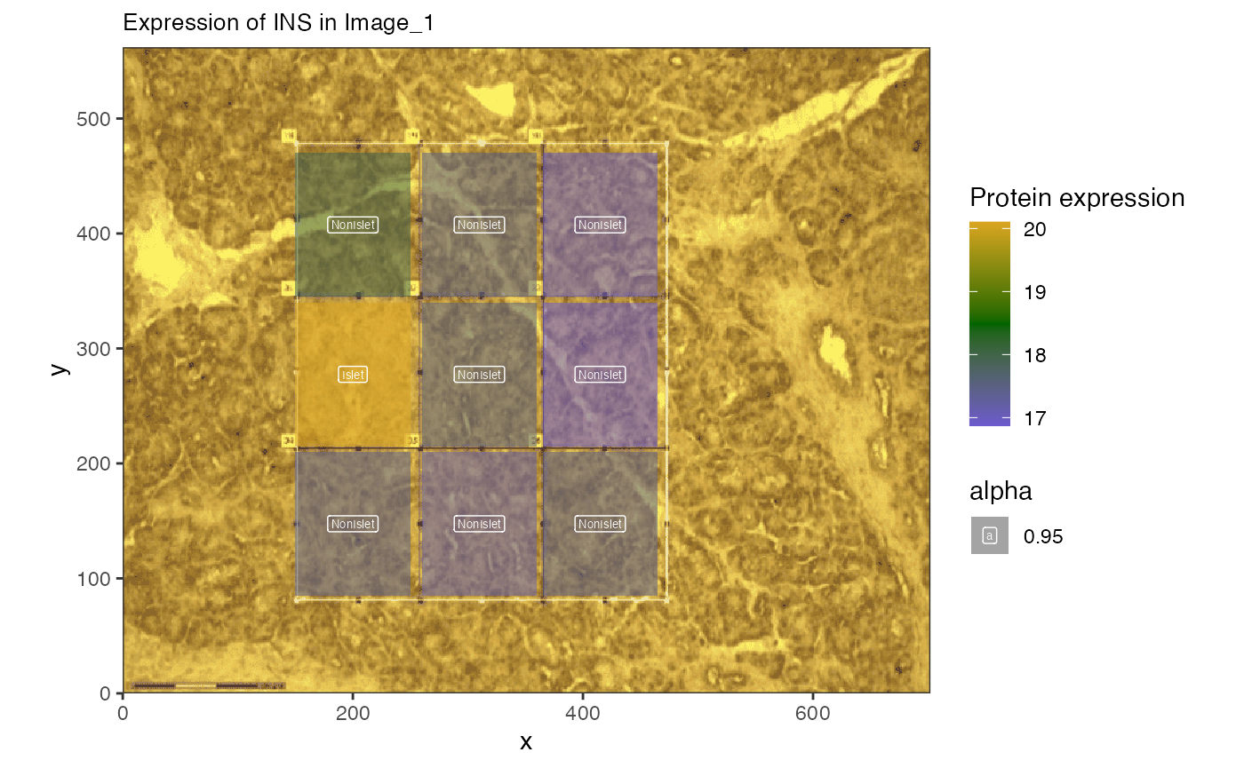
To go further and visualize entire pathways we need to first identify which groups of proteins are of interest using a more unsupervised approach.
Expression and pathway analysis
Now that we have the ability to overlay omic measurements with image
ones, we can identify new features to plot and visualize them. First we
can employ standard differential expression approaches using the voxel
labels and the limma pathway.
Differential expression
First we want to identify specific proteins that are up-regulated in the islet cells (or regions labeled ‘islet’) compared to other regions. We can then plot the set of proteins.
islet_res <- calc_spatial_diff_ex(pooled.panc.spe,
    assay_name = "proteomics",
    log_transformed = FALSE,
    category_col = "IsletOrNot"
)

# we filter the significant proteins first
sig_prots <- subset(rowData(islet_res),
                    NonIslet_vs_Islet.adj.P.Val.limma < 0.01)
# then separate into up-regulated and down-regulated based on fold chnage
ups <- subset(sig_prots, NonIslet_vs_Islet.logFC.limma > 0)
downs <- subset(sig_prots, NonIslet_vs_Islet.logFC.limma < 0)

print(paste(
  "We found", nrow(sig_prots), "significantly differentally \
  expressed proteins including",
  nrow(ups), "upregulated proteins and", nrow(downs), "downregulated"
))
## [1] "We found 241 significantly differentally \n expressed proteins including 168 upregulated proteins and 73 downregulated"Now we can plot those differentially expressed proteins across images.
Plot differentially expressed proteins
If we are interested in the combined expression of proteins we can also visualize those.
spe.plot <- img.spes[[2]]

hup <- spatial_heatmap(spe.plot,
    feature = rownames(downs),
    sample_id = "Image_1",
    image_id = "with_grid",
    label_column = "IsletOrNot",
    interactive = FALSE
)

hup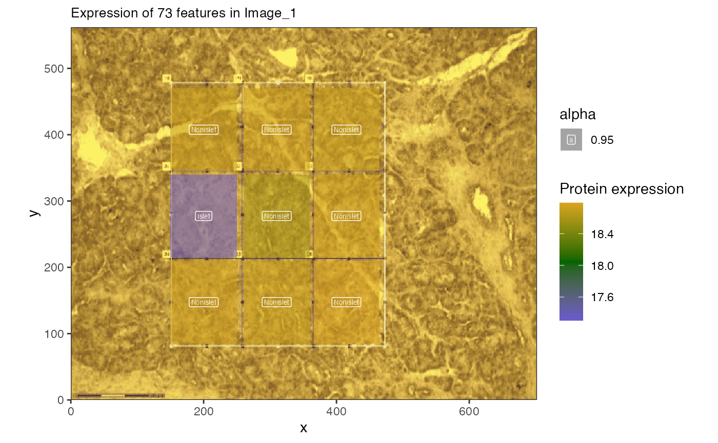
Pathway plotting
We know that there are significantly enriched pathways in insulin secretion, so let’s plot those.
secprots <- ora.res["REACTOME_GLUCOSE_REGULATION_OF_INSULIN_SECRETION", ] |>
    dplyr::select(ingroupnames) |>
    unlist() |>
    strsplit(split = ", ") |>
    unlist()

spe.plot <- img.spes[[2]]

hup <- spatial_heatmap(spe.plot,
    feature = secprots,
    sample_id = "Image_1",
    image_id = "with_grid",
    feature_type = "PrimaryGeneName",
    label_column = "IsletOrNot",
    plot_title = "Glucose regulation proteins",
    interactive = FALSE
)

hup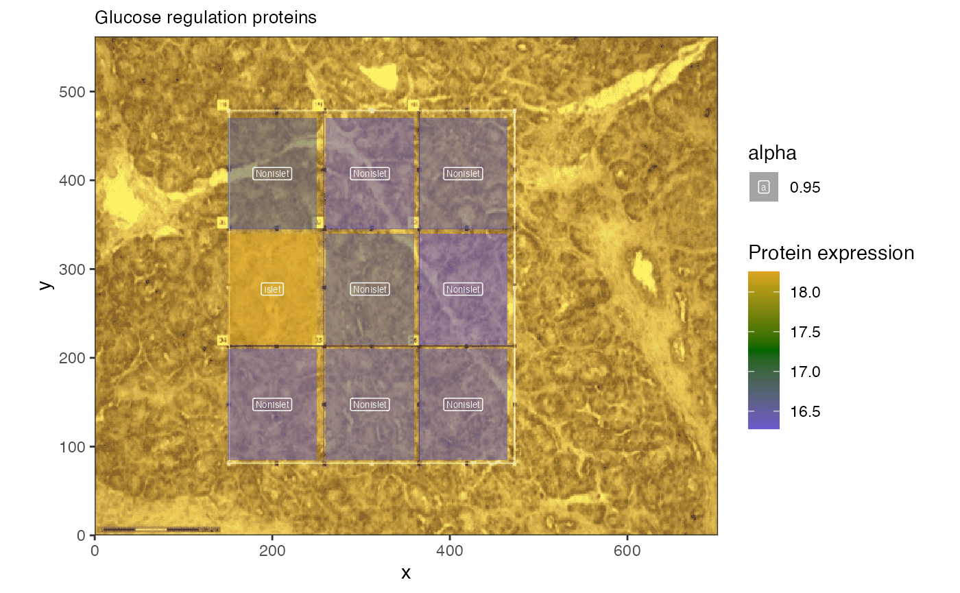
The average expression of the 20 proteins selected is shown to be higher in islet cells than adjacent cells.
Distance based measurements
We can also identify features that are correlated with distance to a feature or a gradient in the sample. This will provide input to rank-based statistical tools that can help identify pathways.
Distance based measurements
First we identify a specific feature, the Islet cell, and use that to identify proteins correlated with distance from the islet in each image. Proteins with a negative correlation are decreasing in expression as they are farther from the islet cells.
## for each image, let's compute the distance of each voxel to
## the one labeled 'Islet'
img.rank <- distance_based_analysis(img.spes[[3]], "proteomics",
      sampleCategoryCol = "IsletOrNot",
      sampleCategoryValue = "Islet"
    )


## now we have the distances, let's plot some interesting proteins
negProts <- rowData(img.rank) |>
  subset(IsletDistancespearmanPval < 0.01) |>
  as.data.frame() |>
  dplyr::arrange(IsletDistancespearmanCor)

DT::datatable(head(negProts),options = list(scrollX = TRUE))
It looks like SH3GL1 is correlated with distance to Islet in a few images.
Plot protein gradient
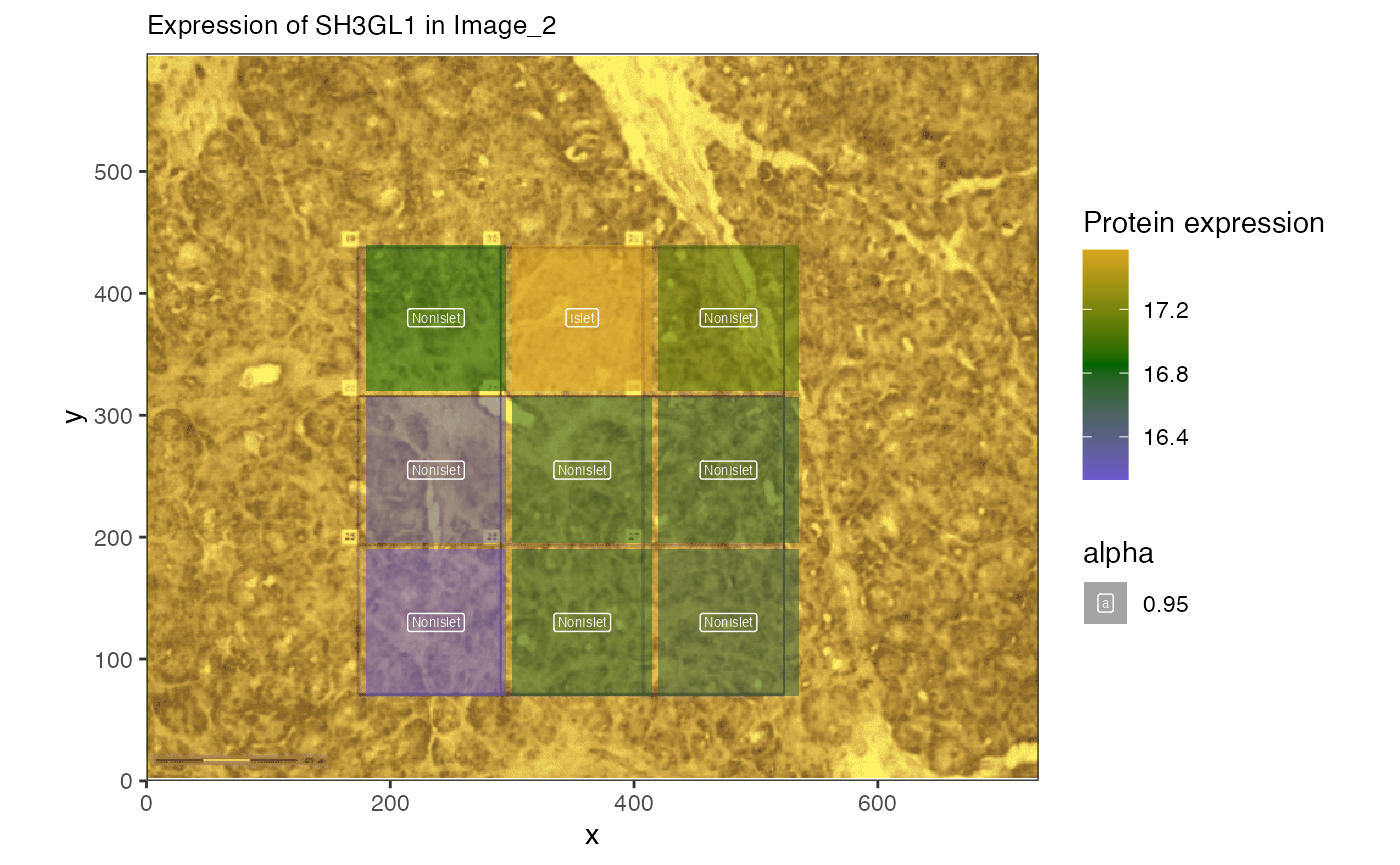
Now we can plot the expression of a protein suspected to have decreasing expression farther from the islet cells.We start with SRP14 and ENPP4
spatial_heatmap(img.spes[[3]],
    feature = "SRP14",
    feature_type = "PrimaryGeneName",
    sample_id = names(img.spes)[3],
    image_id = "with_grid",
    label_column = "IsletOrNot", interactive = FALSE
)
spatial_heatmap(img.spes[[3]],
    feature = "ENPP4",
    feature_type = "PrimaryGeneName",
    sample_id = names(img.spes)[3],
    image_id = "with_grid",
    label_column = "IsletOrNot", interactive = FALSE
)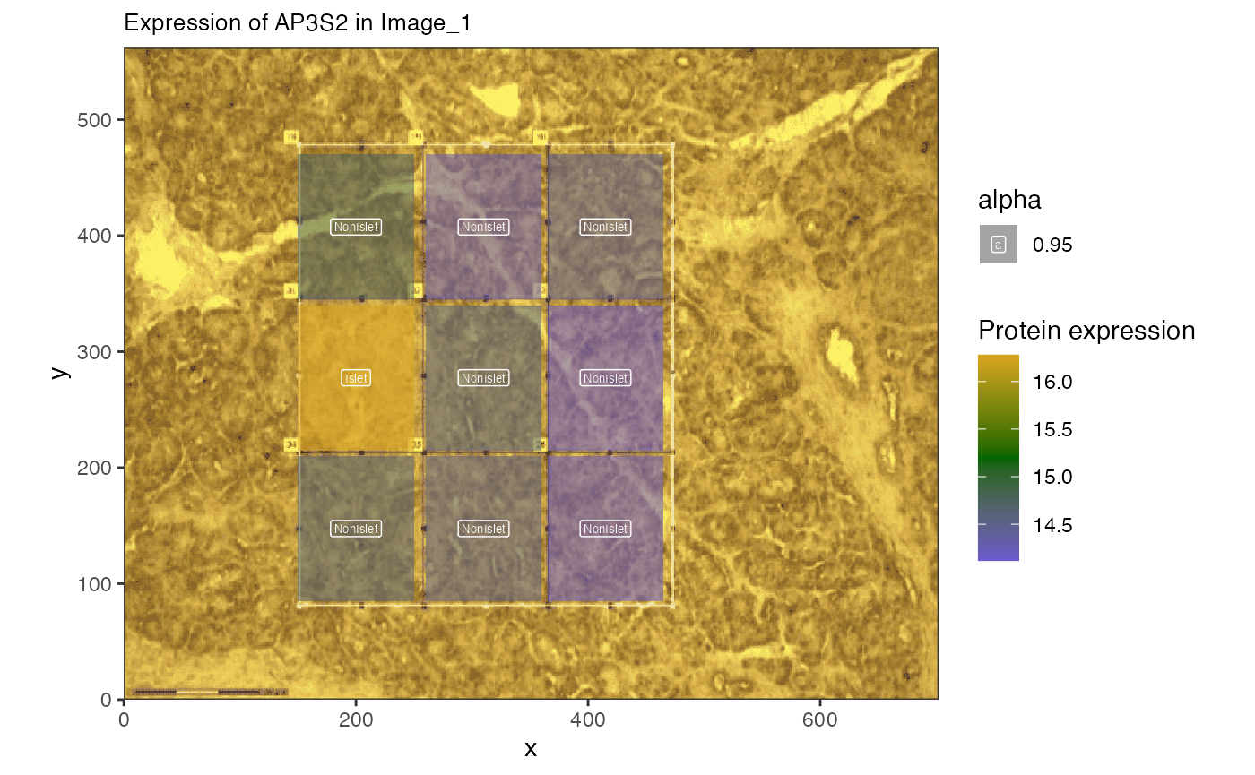
The expression of this protein is lower farther from the Islet. Can we identify trends in the proteins?
Gradient-based enrichment
Rank-based pathway enrichment is a way to evaluate trends pathways
that are over-represented in a ranked list of genes. The
leapR pathway has such functionality and we can use the
rankings as input.
library(leapR)
data("krbpaths")

spe <- img.rank
enriched.paths <- enrich_gradient(spe,
    geneset = krbpaths,
    method = 'ks',
    feature_column = "PrimaryGeneName", # mapped to enrichment data
    ranking_column = "IsletDistancespearmanCor"
)
enriched.paths[, "comp"] <- rep(names(img.spes)[[3]], nrow(enriched.paths))
enriched.paths[, "krbpaths"] <- rownames(enriched.paths)

enriched.paths |>
  subset(pvalue < 0.01) |>
  dplyr::select(-ingroupnames)|>
  dplyr::arrange(BH_pvalue) |>
  DT::datatable(options = list(scrollX = TRUE))
We can see that numerous pathways are coming up as enriched across images, including ribosomal and translation related pathways. Now we can select proteins from a particular pathway and visualize those as well.
Plotting pathways from gradient
rprots <- subset(enriched.paths, krbpaths == "REACTOME_ACTIVATION_OF_BH3_ONLY_PROTEINS") |>
    dplyr::select(comp, ingroupnames)

rprots <- unlist(strsplit(rprots[1, 2], split = ", "))

spatial_heatmap(img.rank,
    feature = rprots,
    feature_type = "PrimaryGeneName",
    sample_id = names(img.spes)[3],
    image_id = "with_grid",
    label_column = "IsletOrNot", interactive = FALSE
)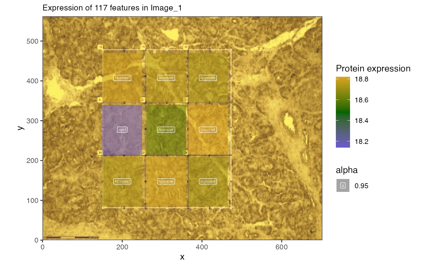
This shows the ribosomal protein expression across the image.
Network plotting
We can also look at the correlation of the ribosomal proteins in a graph. The correlation code takes a while but then we can reduce the graph to the proteins we are most interested in, or those that are most correlated.
##
## Attaching package: 'tidygraph'
## The following objects are masked from 'package:IRanges':
##
## active, slice## The following objects are masked from 'package:S4Vectors':
##
## active, rename## The following object is masked from 'package:stats':
##
## filter## Loading required package: ggplot2
##correlation analysis can be slow, so let's only evaluate the top 1000 most variable proteins
varprots = apply(assay(img.spes[[3]]),1,var,na.rm = TRUE) |>
  sort(decreasing = TRUE) |>
  names()

full_graph <- spatial_network(img.spes[[3]],target_features = rprots,
                              'proteomics','PrimaryGeneName')
## Joining with `by = join_by(rowval)`
##how subset for only those 81 proteins
rgraph <- full_graph |>
  tidygraph::activate(nodes) |>
  dplyr::filter(name %in% rprots) |>#[sample(20)]) |>
  tidygraph::activate(edges) |>
  dplyr::filter(abs(corval) > 0.25)

##then we can plot
ggraph::ggraph(rgraph) +
   geom_edge_link(aes(colour = corval)) +
   geom_node_point() +
   geom_node_label(aes(label = name))
## Using "stress" as default layout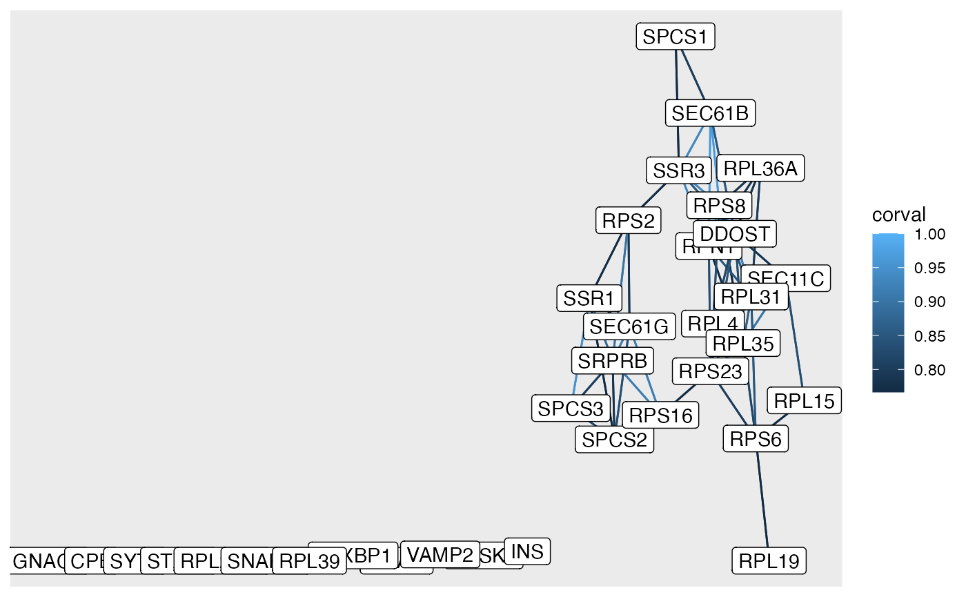 Here are the highly correlated edges between the proteins selected in
the cytokine pathway.
Here are the highly correlated edges between the proteins selected in
the cytokine pathway.
Summary
This vignette shows various functions to apply in managing spatial proteomics data in spammR.
Session info
## R version 4.6.1 (2026-06-24)
## Platform: x86_64-pc-linux-gnu
## Running under: Ubuntu 24.04.4 LTS
##
## Matrix products: default
## BLAS:   /usr/lib/x86_64-linux-gnu/openblas-pthread/libblas.so.3
## LAPACK: /usr/lib/x86_64-linux-gnu/openblas-pthread/libopenblasp-r0.3.26.so;  LAPACK version 3.12.0
##
## locale:
##  [1] LC_CTYPE=C.UTF-8       LC_NUMERIC=C           LC_TIME=C.UTF-8
##  [4] LC_COLLATE=C.UTF-8     LC_MONETARY=C.UTF-8    LC_MESSAGES=C.UTF-8
##  [7] LC_PAPER=C.UTF-8       LC_NAME=C              LC_ADDRESS=C
## [10] LC_TELEPHONE=C         LC_MEASUREMENT=C.UTF-8 LC_IDENTIFICATION=C
##
## time zone: UTC
## tzcode source: system (glibc)
##
## attached base packages:
## [1] stats4    stats     graphics  grDevices utils     datasets  methods
## [8] base
##
## other attached packages:
##  [1] ggraph_2.2.2                ggplot2_4.0.3
##  [3] tidygraph_1.3.1             leapR_1.0.0
##  [5] BiocFileCache_3.2.0         dbplyr_2.6.0
##  [7] spammR_0.99.25              limma_3.68.5
##  [9] SpatialExperiment_1.22.0    SingleCellExperiment_1.34.0
## [11] SummarizedExperiment_1.42.0 Biobase_2.72.0
## [13] GenomicRanges_1.64.0        Seqinfo_1.2.0
## [15] IRanges_2.46.0              S4Vectors_0.50.2
## [17] BiocGenerics_0.58.1         generics_0.1.4
## [19] MatrixGenerics_1.24.0       matrixStats_1.5.0
## [21] BiocStyle_2.40.0
##
## loaded via a namespace (and not attached):
##   [1] RColorBrewer_1.1-3  jsonlite_2.0.0      wk_0.9.5
##   [4] magrittr_2.0.5      magick_2.9.1        farver_2.1.2
##   [7] rmarkdown_2.32      fs_2.1.0            ragg_1.5.2
##  [10] vctrs_0.7.3         spdep_1.4-2         memoise_2.0.1
##  [13] rstatix_1.1.0       htmltools_0.5.9     S4Arrays_1.12.0
##  [16] curl_8.0.0          broom_1.0.13        s2_1.1.11
##  [19] SparseArray_1.12.2  Formula_1.2-6       sass_0.4.10
##  [22] spData_2.3.5        KernSmooth_2.23-26  bslib_0.12.0
##  [25] htmlwidgets_1.6.4   desc_1.4.3          httr2_1.3.0
##  [28] impute_1.86.0       plotly_4.12.1       cachem_1.1.0
##  [31] igraph_2.3.3        lifecycle_1.0.5     pkgconfig_2.0.3
##  [34] Matrix_1.7-5        R6_2.6.1            fastmap_1.2.0
##  [37] digest_0.6.39       ggnewscale_0.5.2    textshaping_1.0.5
##  [40] crosstalk_1.2.2     RSQLite_3.53.3      ggpubr_1.0.0
##  [43] filelock_1.0.3      labeling_0.4.3      httr_1.4.9
##  [46] polyclip_1.10-7     abind_1.4-8         compiler_4.6.1
##  [49] proxy_0.4-29        bit64_4.8.6         withr_3.0.3
##  [52] S7_0.2.2            backports_1.5.1     carData_3.0-6
##  [55] viridis_0.6.5       DBI_1.3.0           ggforce_0.5.0
##  [58] ggsignif_0.6.4      MASS_7.3-65         DelayedArray_0.38.2
##  [61] rjson_0.2.23        classInt_0.4-11     tools_4.6.1
##  [64] units_1.0-1         otel_0.2.0          glue_1.8.1
##  [67] grid_4.6.1          sf_1.1-2            gtable_0.3.6
##  [70] tzdb_0.5.0          class_7.3-23        tidyr_1.3.2
##  [73] data.table_1.18.6.1 hms_1.1.4           sp_2.2-3
##  [76] car_3.1-5           XVector_0.52.0      ggrepel_0.9.8
##  [79] pillar_1.11.1       dplyr_1.2.1         tweenr_2.0.3
##  [82] lattice_0.22-9      bit_4.6.0           deldir_2.0-4
##  [85] tidyselect_1.2.1    knitr_1.51          gridExtra_2.3.1
##  [88] bookdown_0.48       xfun_0.60           graphlayouts_1.2.5
##  [91] statmod_1.5.2       DT_0.34.0           yaml_2.3.12
##  [94] boot_1.3-32         evaluate_1.0.5      tibble_3.3.1
##  [97] BiocManager_1.30.27 cli_3.6.6           reticulate_1.46.0
## [100] systemfonts_1.3.2   jquerylib_0.1.4     Rcpp_1.1.2
## [103] png_0.1-9           pkgdown_2.2.1       readr_2.2.0
## [106] blob_1.3.0          viridisLite_0.4.3   scales_1.4.0
## [109] e1071_1.7-17        purrr_1.2.2         rlang_1.3.0